
You are currently browsing the category archive for the ‘Design’ category.


Well my idea of posting more has gone nowhere this year so here’s something I’ve been collecting in recent years. Most of us probably browse past these records thinking ‘oh it’s a cheesy 60’s Latin take on Bond themes, probably won’t play it more than once’, but we’ve missed out on some great arrangements, playing and production! At least 80% of the compilations have been hugely entertaining to my ears, not sure what the rest of the tenants in my building think ha ha.


Not to mention the usually glorious covers! The rule seems to be to include as many as the art department can afford scantily clad ‘Bond-type’ women striking action poses in imaginary spy or crime films and TV shows. I think this ‘imaginary’ aspect actually allows for more interesting visual interpretations of the tunes than the usual screen shots used from productions. The Basie Meets Bond, Thunderball and Senor 007 covers are particularly striking, or ridiculous, depending on your point of view. Others like the Al Caiola and Bang Bang Bang records feature more imaginative design work. I have found roughly half of these so far, which means the hunt shall continue!


Now it has to be said that in reality the covers were exploiting a current trend and one gets the sense that they were pumped out at the same rate as the movies themselves. Some have a distinct sense of something brazen and even illegal going on, much like the many Bond spin-offs and spoof films themselves. But again, some of the films and soundtracks are totally worth finding.


Or more accurately 3D animation, real time computer graphics and projection mapping interacting with electronic music to create something that merges theater set design and production, cinema, live music and virtual reality. One could imagine a character out of say, Blade Runner, walking into a concert or nightclub scene resembling what I saw in this performance. Unfortunately it wasn’t live but on YouTube, though it would be quite an experience to see it at the Sydney Opera House in person. As usual, my discovery was out of tune with any sequential time sequence as I’m busy bouncing all over the place.

I first stumbled upon it while looking up Amon Tobin, the Brazilian electronic musician who collaborated on this project with director Vello Virkhaus, media production collective V Squared Labs, Leviathan and set designer Vita Motus. The music was originally from Tobin’s album ISAM (which has been a part of my lounge room ‘ambience’ lately), an Acronym for “Invented Sound Applied to Music”, the record was: ‘an experiment in synthesizing field recordings and transforming them into new physically playable instruments to create unique sound palettes.’

The set itself at various times looks like a dystopian city of the future, a mass of broken T.V. sets, a giant game of Tetris or some kind of self conscious but irrational space ship with Tobin embedded in the structure as the captain. It’s at times a disorienting 21st century version of Fritz Lang’s Metropolis assembled from musique and video concrete sources, filtered through Kraftwerk’s industrial elegance and finally interpreted by the mix, match and fusion of DJ culture. This is a one of a kind audio/visual spectacle and definitely worth your time dear reader. Let it paint unique pictures in your own mind.


So for some insane reason I’ve agreed to DJ at a friend’s bar maybe once a month even though I have no clue what I’m doing ha ha. No requests either please because who knows where anything is! I also took time to document some of the labels and paper sleeves, gives one a real cross section of record label designs over the last 50 years or so.

What we essentially have here are the original mp3’s but only this lot is a lot more work to sort out and clean. I just don’t have the same enthusiasm or interest in something like iTunes, digital media doesn’t involve the treasure hunt, meeting fellow collectors and in some cases finding genuine design artefacts.

So I’ve been using another blog for my own work, but I don’t think that site has been maintained by its developers since 2013 at least?? Not sure what was happening there, but it was unstable at best and at times I couldn’t log in at all which is a bit of a problem when you’re the admin ha ha. Anyway, I’ve shared bits and pieces of it on this blog but now it’s been fully integrated into another WordPress site so we’ll see how the juggling act evolves during the year.
remakeremodelstudio.wordpress.com
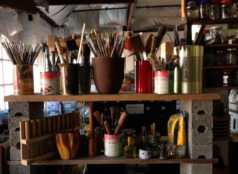
This blog is basically the research and inspiration board for my work under the Remake/Remodel moniker, the name borrowed from a Roxy Music song but signifying using any materials around you as springboards for creative work. I just find that working with what you have available in your own environment is a more realistic way to get inspired and a truer reflection of who you really are.


Continuing on from the last post, here are some pagan costumes from rituals still practiced today across the European continent. Magnificently documented by French photographer Charles Freger for his ‘Wilder Mann’ series, it’s people dressed up as animals or monsters. The creations look like something out of a dadaist or surrealist play but actually date back to the neolithic times. These traditions mainly mark the winter solstice and the beginning of spring, stemming from a time when appeasing nature (various gods) was the difference between life and death. I’d say that in modern times its mainly a chance to get drunk and celebrate our animal half, to let our hair down for a few days or hours before going back to our respective cubicles. It’s the equivalent of New Year’s, Halloween, camping with friends or surviving a particularly wild gig.


Some of these costume designs are used to bestow fertility, scold naughty children, chase away evil spirits and for parades and ritual dancing. There is design which stemmed from our modern times and needs but there is a different power inherent in ancient objects, costumes and tools which have been reiterated over many centuries. Japanese design often features objects that have been modified over lengthy periods of time, always the same but always slightly different in response to the changing environment, technology, society etc. Short shelf life or built in obsolescence just doesn’t have the same emotional or intellectual pull no matter how shiny it is or how much press one gives it.


So I tend to see these costumes as ‘Organic Design’, fulfilling real and imagined needs and having a clear message without any academic market researched psycho-analytical mumbo jumbo. Its not selling the latest trend, it operates on a whole other time scale. We are never going to know which board of ancient hipsters decided on the size of the horns, the colour of the cloth or the choreography of the dance moves and that’s OK too. It’s our instincts which keep us coming back for more.


 Leading on from my last post about French street artist Invader, here is a local offshoot (Adelaide, South Australia, to be precise) and he works under the name of Tyler Mario. Most of the information I could find is in the article I scanned above, because I’m old school like that ha ha. Below are some examples of pixelated versions of characters the artist likes, and now I wonder how many other people have put their own spin on this idea around the world?
 Photos taken during the Adelaide Fringe Festival, the Mario pieces being only a small part of a whole street makeover called Little Rundle Street Project, and believe me a lot of streets in this town need more colour!


Taking his inspiration from 70’s and 80’s video games (his name is derived from the ‘Space Invaders’ arcade game), French artist Invader is interesting in a variety of ways, not least in the fact that he uses mosaics instead of spray paint. He has also used Star Wars characters, Pink Panther and Popeye. Like Banksy and many others, Invader protects his identity and refers to himself as an Unidentified Free Artist and has been ‘invading’ city spaces all over the world since 1998. In true video gaming style, he’s also kept score: 3280 Invaders / 65 CITIES ha ha. And speaking of identity, he’s one the artists who appears in the film ‘Exit Through The Gift Shop’, itself an interesting and often funny look at celebrity and the art world.


If you’ve ever had to remove tiles you’ll know that its easier to break them than to save them as some collectors have found out with Invader’s work. One of his solutions is to offer ‘invasion kits’ for sale, so you too can build-your-own Space Invaders ha ha ha. Alternatively you could go to your local home-depot-bunnings-masters-whatever monstrosity you have in your town and purchase some construction strength glue and cheap building material and invade space with your own creation! Anyway, I like the approachable nature of this project and the fact that its industrial nature has the potential to make it almost invisible. ‘Why would you want to make it invisible?’ I hear you say and my point is that quietly altering a highly regimented and controlled environment is more important than getting arrested, banned or being famous for 15 minutes.


I don’t think I’ve written much about street art previously, but this process, along with old-school DIY book/zine/record publishing and the still largely decentralized internet, seems to be the last frontier of free expression and speech. Wanting to side step the museum and gallery system, Invader sees himself as a ‘hacker’ of public space, displaying work at street level for everyone to enjoy. Working in public spaces also rearranges a city’s architecture to an extent, at least giving it a much needed splash of colour. We already have our head and physical spaces invaded by all kinds of junk so why not Space Invaders or Shepard Fairey’s Andre The Giant?


")
")
")
")
Wow WordPress has informed me this morning that I’ve been doing this thing for 7 years! How time flies, so here’s to 7 more years! I’ve enjoyed the journey and the cybernetic winds of destiny that have brought some of us into contact ha ha. Speaking of flying, destiny and time, there was a time when people (well at least in the East and West blocks of the mid 20th century) dreamed of a space age and this was reflected in music, films, clothes, cars, household appliances, architecture, you name it, it was everywhere. It was our destiny to explore and live in space, inner and outer. I think the 60’s marked the point where people increasingly turned to inner space as everyone realized that cold war paranoia, racial/class tensions, corporate wars and all out Roman-feast type consumerism was here to stay.
")
")
")
")
These days inner space means plugging into the internet and staying there as long as possible in the belief that somehow we are living in the future. What we have for the most part is a bunch of techno gadgets in the attic, far away from personal jet-packs and holidays on the moon. So NASA’s ‘imagination is our window into the future’ rallying cry reminds me that, for example, science fiction novels and movies were these windows before google search. I wonder if my generation can muster the same kind of innocent amazement without detachment and irony? Anyway, what this long rant actually brings me to are these imaginary space travel posters that evoke those very same novels by Asimov, Clarke, Dick, Gibson and others we all sought out in dusty second hand bookshops at one time or another.
")
")
")
")
3 of these were designed by Invisible Creature, a multi-disciplinary design and illustration studio founded in 2006 and based in Seattle, WA. This was a special project for the two founders as their grandfather Al Paulsen was an illustrator and graphic designer at NASA for over 30 years.
blog.invisiblecreature.com/new-posters-for-nasa/
www.jpl.nasa.gov/visions-of-the-future/
Been too busy to think about posting anything so here’s a bit of a tribute to David Bowie, pretty interesting I thought. Some are funny and some are just downright scary ha ha, created by designer/illustrator Butcher Billy.


Richard M Powers (sounds like the sort of name a comic book hero would have!) is known for his many cover illustrations for pulp and science fiction paperbacks from the 1940’s to the 1990’s. His striking imagery caught my eye a few years ago because it came off as playful rather than dry and academic.


Here are some examples of surrealist, almost abstract expressionist paintings or designs which sometimes remind me of Jim Flora’s figurative work. He’s known for his record cover design and worked in the same era but is much more cartoonish and illustrative. Maybe it’s an odd association but I’ve written about Flora before on this blog if you’re interested in checking him out. Other names such as Pollock, Miro and Dali come to mind. The approach seems fairly free form and open ended and is visually very inventive, employing one or any combination of modern (at the time) techniques. Some compositions look like they just want to continue beyond the margins of the cover as if to say ‘you can’t contain me’.


